
Honestly, when I first encountered the Wiggers diagram in my first year of medical school, I wanted to cry. No—forget it. IDidCrying. It was exactly 2 a.m. in the library, between an empty coffee cup and a half-eaten granola bar, staring at what looked like a deformed spider crawling across graph paper. Aortic pressure lines, ventricular volume curves, ECG tracings—everything was moving in a way that made no sense.
After three failed attempts at memorization and a very patient classmate who had once stopped answering my phone, I finally cracked the mystery. And that’s exactly why I’m writing this today. Because I know how hard this struggle is, and I want to save you from the same mental breakdown I went through late at night.
The Wiggers diagram is a versatile solution to cardiac physiology. It shows you everything—electrical activity, pressure changes, volume changes, even the sound of the heartbeat—all in one comprehensive picture. It is named after Dr. Carl J. Wiggers, who essentially dedicated his entire career to mapping the cardiac cycle. This diagram has been both awe-inspiring and enlightening to medical students since the early 1900s.
However, here’s the real surprise. Once you understand the five key concepts I’m going to explain, that chaotic tangle of lines will transform into a beautiful form. You’ll see the story of a single heartbeat unfolding like a well-planned dance. So grab your coffee, sit back, and let’s solve the Wiggers diagram together.
What exactly is this Wiggers diagram thing?
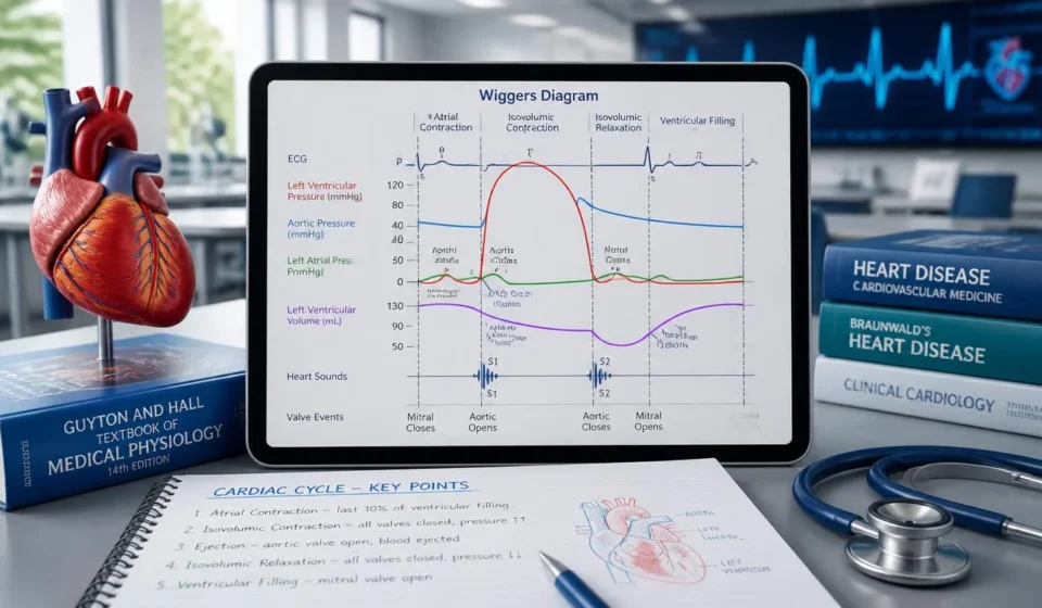
Before we get into the five concepts, we need to clarify what we’re actually looking at. A Wiggers diagram is a graphical representation that depicts the various physiological events over time during a single cardiac cycle. Think of it as a timeline of your heartbeat, capturing everything from the electrical spark that starts the process to the mechanical pressure that pumps blood through your body.
The horizontal axis represents time—usually about 0.8 seconds for a normal resting heart rate of 75 beats per minute. The vertical axis has multiple parameters stacked on top of each other, so you can see the relationship between them. Here you’ll see aortic pressure, left ventricular pressure, left atrial pressure, ventricular volume, ECG, and sometimes phonocardiogram (the sound of the heartbeat)—all plotted together.
This is why the Wiggers diagram is so powerful. It doesn’t just show you isolated measurements, it shows you cause and effect in real time. You can actually see how the QRS complex on the ECG increases ventricular pressure, which then forces the aortic valve to open, creating the waveform you see on the aortic pressure trace. It’s like watching dominoes fall in slow motion.
I remember the exact moment it became clear to me. I was sitting in my apartment, tracing the lines with my finger, and it suddenly dawned on me that the Wiggers diagram wasn’t some abstract, impossible thing—it was actually a story. A story of a heartbeat. And the moment I started reading it like a narrative, everything changed.
Concept 1: Electrical Design—How the ECG Drives Everything
The first concept you must understand is that electrical activity always comes first. Always. The ECG trace in the Wiggers diagram acts as the master controller or blueprint that sets everything else in motion. Without that initial electrical spark, no mechanical event would occur.
P waves and that all-important atrial kick
The story begins with the P wave. This little peak on the ECG represents atrial depolarization—the electrical signal that tells the atria to contract. When you see that P wave on the Wiggers diagram, you know that atrial systole is about to occur.
What is produced by this atrial contraction is what we call the ‘atrial kick’. This is the final push of blood into the ventricle, which completes about 10-20% of the total blood filling of the ventricle. In the diagram, you will see a slight increase in atrial pressure (the ‘a’ wave) and a slight increase in the volume of the ventricle after the P wave.
I learned the hard way why this is important. During my internship in cardiology, I saw an elderly patient with atrial fibrillation. Without that coordinated atrial kick, his cardiac output was significantly reduced. The Wiggers diagram would have shown you clearly why—no P wave, no ‘A’ wave, no contribution from the atrium to blood filling. Just passive flow, and that was a huge problem for the patient.
QRS Complex—Prepare for Shock
Then comes the most important thing. The QRS complex is the ventricular depolarization, and it’s the most obvious feature of the ECG trace. When you see those long, pointed waves on the Wiggers diagram, you know that ventricular systole is about to begin.
You need to visualize this sequence. The QRS complex appears. Within a few milliseconds, the ventricles begin to contract. The pressure inside the left ventricle begins to rise rapidly. The mitral valve closes with a loud thud (producing the first heart sound, S1), and the ventricle begins to squeeze the blood as if squeezing a stress ball with a fist.
The beauty of the Wiggers diagram is that you can follow this relationship directly. Place your finger over the QRS complex, then move your finger horizontally to the right. You will see that the ventricular pressure line will almost immediately move upwards. Cause and effect are as clear as day.
T-Wave—Time to relax
Finally, there is the T wave, which represents ventricular repolarization. This is the electrical recovery phase, and it indicates that the ventricles are relaxing and preparing for the next cycle.
The T-wave on the Wiggers diagram is seen at the exact moment when ventricular pressure begins to fall and the ventricle enters its relaxation phase. It is an electrical “rest” signal, telling the heart muscle to rest and prepare for the next filling wave.
Here is a point that most textbooks don’t emphasize enough. The relationship between these electrical events and mechanical events is not just theoretical knowledge. It is very important clinically. When you see a prolonged QT interval when reading an ECG, you understand that repolarization is delayed. The Wiggers diagram shows you clearly what this means mechanically—prolonged relaxation, the potential risk of arrhythmia, and all the consequences that follow.
Concept 2: Pressure dynamics—conflict between ventricle and aorta
The second concept revolves around pressure. The Wiggers diagram is essentially a battleground of pressure, showing the constant tension between ventricular pressure and aortic pressure. Understanding this relationship is crucial to understanding exactly how blood moves through the heart.
Iso-volumetric contractions—so much effort, but no movement
This is where things get interesting. At the beginning of ventricular systole, the left ventricle begins to contract and the pressure increases. But the problem is—both the mitral valve and the aortic valve are still closed. As a result, the volume of blood inside the ventricle does not change. It’s like banging on a closed door. No matter how hard you try, nothing moves.
This phase is called iso-volumetric contraction, and you can see it clearly on the Wiggers diagram. The ventricular pressure line goes straight up, but the ventricular volume line stays flat. This is one of those moments where the diagram really shows you what’s going on inside.
I remember my physiology teacher hammering this into our heads. She would tap the board with her pointer and say, “Iso-volumetric means there is no change in volume. If the volume is not changing, then for some reason there is pressure building up. And that is what is causing the aortic valve to open forcefully.”
Excretion stage—let the blood flow
When the pressure in the left ventricle finally exceeds the pressure in the aorta (usually around 80 mmHg), the aortic valve opens. This is the ejection phase, and it is at this stage that all the work done to build up the pressure finally pays off.
In the Wiggers diagram you will see that both the ventricular pressure and the aortic pressure increase together. At this stage the ventricular pressure usually peaks at around 120 mmHg, and shortly after that the aortic pressure also reaches around 120/80 mmHg. The blood is being pumped into the aorta at a high rate, and you can almost feel the force of this contraction just by looking at the lines.
The diagram shows two parts of the ejection phase—rapid ejection, where the lines rise steeply upward, and diminished ejection, where the lines flatten out as the ventricles begin to contract. This is a nice visual representation of the heart’s pumping action.
Dicrotic notch—that small notch whose significance is immense.
One of my favorite features of the Wiggers diagram is this. When ventricular systole ends and the ventricle begins to relax, its pressure drops below aortic pressure. For a moment, blood begins to flow in the reverse direction toward the ventricle. But the aortic valve catches it and immediately closes to prevent reverse flow.
This closure creates the dicrotic notch—a small but very important depression in the aortic pressure trace. It is also known as the incisura and marks the exact moment when the aortic valve closes.
Now for a clinical case. I was once observing a cardiac catheterization, where the doctor immediately diagnosed aortic regurgitation by noting the dichroic notch on the pressure tracing. The notch was almost nonexistent, because the valve was not closing properly. The Wiggers diagram prepared me to understand exactly what we were seeing—and why it was important to the patient.
Concept 3: Change in quantity—observing what actually moves
The pressure graph shows you the forces, but the ventricular volume graph on the Wiggers diagram tells you the actual amount of blood flowing through the heart. This is where things get specific—we’re talking about milliliters of blood here, not just pressure measured in millimeters of mercury.
End-diastolic volume—full tank
At the end of diastole, the ventricle is as full as it can be. This maximum volume is called the end-diastolic volume (EDV), and it’s essentially your preload—that is, the amount of blood that fills the ventricle before it contracts.
In the Wiggers diagram, EDV is the highest point on the ventricular volume curve. This point is reached after the end-point blood flow has been achieved by the atrial kick. In a healthy adult, EDV is typically 120-140 mL.
I didn’t realize this until I started working with real patients. EDV is not just a number. It represents the actual physical stretch of the heart muscle fibers. The greater the stretch, the greater the force of contraction—that’s how the Frank-Stirling method works. The Wiggers diagram gives you a visual representation of that ‘stretch’ before contraction begins.
End-systolic volume—after pressure
On the other hand, end-systolic volume (ESV) is the minimum volume inside the ventricle after the end of blood ejection. This volume is what remains after contraction, which is usually around 50-60 milliliters.
The difference between EDV and ESV is your stroke volume—which is about 70-80 milliliters of blood pumped out with each beat. Multiplying stroke volume by heart rate gives you cardiac output, the ultimate measure of how well your heart is working.
I learned to love this relationship during my internship in critical care. We would use echocardiography to calculate stroke volume, and I would mentally superimpose the Wiggers diagram on the images. Seeing the volume trend in real time helped me understand why certain treatments worked—or failed.
Iso-volumetric relaxation and filling—recharge cycle
During iso-volumetric relaxation, the volume of the ventricle remains unchanged. All valves are closed, pressure decreases, but the volume cannot change, because there is no room for blood to enter or leave.
Once ventricular pressure drops below atrial pressure, the mitral valve opens and passive filling begins. This is shown as a rapid upward slope on the volume trace. The ventricle first fills quickly (rapid filling), then fills more slowly (reduced filling or diastasis), and then the whole cycle begins again with the next P wave.
The volume trace of the Wiggers diagram is honestly my favorite part. It’s very straightforward—you can clearly see when blood is entering the ventricle and when it’s leaving. There are no complicated pressure variations to explain, just pure volume changes that tell the story of blood entering and leaving the ventricle.
Concept 4: Atrial pressure waves—’a’, ‘c’, and ‘v’ tell their story
This is the idea that most people avoid, and it’s a shame, because the atrial pressure graph on the Wiggers diagram is packed with a lot of useful information. Those three little waves—’a’, ‘c’, and ‘v’—each give a specific description of what’s happening inside the heart.
‘A’ wave—function of atrial systole
The ‘a’ wave appears immediately after the ‘P’ wave on the ECG and represents atrial systole. That atrial contraction we talked about earlier? This is the sign of its pressure.
You can see the ‘a’ wave on the atrial pressure trace as a small bulge, which occurs just before the QRS complex. This pressure is created when the atria squeeze to send the last point of blood into the ventricles.
Here is an important medical fact. If you see a large ‘A’ wave on a pressure tracing, it may indicate a condition such as tricuspid stenosis or pulmonary hypertension. The atrium has to work harder to push blood through a narrowed valve, which creates a high pressure wave. The Wiggers diagram gives you a basis for identifying these abnormalities.
‘C’ wave—Mitral valve prolapse
The ‘c’ wave is subtle—it can easily be missed if you’re not paying attention. It occurs just after the QRS complex and is caused by the left atrium dilating against the closed mitral valve during iso-volumetric contraction.
Wait, let me explain it in simple terms again. The ventricle contracts, the pressure increases, and the mitral valve slides slightly back into the atrium. This causes a small pressure surge, which we call the ‘C’ wave.
To be honest, I never really thought about this wave until a cardiologist mentioned it during a case presentation. Pointing to a pressure tracing, he said, “Notice the ‘C’ wave. It looks exaggerated here because of mitral regurgitation.” I nodded as if I fully understood what he meant, but in my mind I was desperately trying to remember what the ‘C’ wave actually was. Lesson learned—every detail of a Wiggers diagram matters.
‘v’ wave—blood flow in the veins during ventricular systole
The ‘V’ wave occurs during ventricular systole. While the ventricles are busy pumping blood throughout the body, blood from the lungs simultaneously returns to the atrium. Since the mitral valve is closed, this returning blood accumulates in the atrium and the pressure continues to increase, reaching its peak—this is the ‘V’ wave.
In the Wiggers diagram, you can see the ‘v’ wave as a rise in atrial pressure during the ejection phase, which peaks just as the T wave appears. It’s a gentle reminder that the heart is a continuous system—blood is always moving, even when one of its chambers is busy contracting.
Concept 5: Heartbeat—Explanation of “lab-dub”
The last concept I want to discuss is the location of the heart sounds on the Wiggers diagram. That familiar ‘lab-dub’ rhythm is not the sound of the heart contracting—it’s the sound of the valves closing. And this diagram shows you clearly when and why these sounds occur.
First heartbeat (S1)—indicates the beginning of “lube”
The first heart sound, S1, is associated with the closure of the atrioventricular valves—the mitral and tricuspid valves—at the very beginning of ventricular systole.
In the Wiggers diagram, the position of S1 is immediately after the QRS complex, at the beginning of the rapid pressure increase within the ventricle. It is the acoustic indicator of the transition from diastole to systole.
I remember my first physical exam rotation. The attending physician asked me to identify S1 and S2, and I confidently pointed to what I thought was the correct term. It turned out that I had them completely backwards. If only I had understood the Wiggers diagram better at that moment—I could have identified the valve closure process at exactly the right moment in the cardiac cycle and never made that mistake again.
Second Heart Sound (Season 2)—Ends with “Dub”.
The second heart sound, S2, is produced by the closure of the semilunar valves—the aortic and pulmonary valves—at the end of ventricular systole.
In the Wiggers diagram, S2 exactly coincides with the dicrotic notch of the aortic pressure trace. This indicates the end of ejection and the beginning of iso-volumetric relaxation.
Here’s why it’s medically important. Splitting of S2—where you hear “lub-dub-dub” instead of “lub-dub”—can indicate a delayed closure of one of the semilunar valves. The Wiggers diagram shows you the timing of this, and if you can understand that timing, you can identify a problem if it occurs.
Key lessons learned from the Wiggers diagram
Okay, let’s summarize everything we’ve discussed so far. Here are the key principles that will help you read and understand Wiggers diagrams like a pro:
- Electrical activity always precedes mechanical events. The ECG waves (P, QRS, T) are the main regulators, and every pressure and volume change follows them. This causal relationship is the basis of cardiac physiology.
- Pressure differences drive everything. Valves don’t open on their own—they respond to pressure differences between the chambers. When the pressure in the ventricles exceeds the pressure in the aorta, the aortic valve opens. When the pressure drops below that, the valve closes. The Wiggers diagram shows these variations in real time.
- There is an iso-volumetric phase. During iso-volumetric contraction and expansion, all valves are closed and the volume of the ventricles remains constant, but the pressure changes dramatically. This is a unique feature of cardiac activity, which is perfectly illustrated in the diagram.
- Changes in volume define the cardiac cycle. Systole is the ejection of blood (volume reduction). Diastole is the intake of blood (volume increase). The easiest way to understand which phase of the cardiac cycle we are in is to graph the volume of the ventricles.
- The heart sounds are the sounds of the ventricles closing. At the beginning of systole, S1 is the closure of the AV ventricles. At the end of systole, S2 is the closure of the semilunar ventricles. These sounds correspond to specific points on the Wiggers diagram.
Frequently Asked Questions about Wiggers Diagrams
1. What does a Wiggers diagram actually show me?
A Wiggers diagram shows the complete timeline of a cardiac cycle, which includes electrical activity (ECG), pressure changes (aortic, ventricular, atrial), volume changes (ventricular), and acoustic events (heart sounds). It is the most complete visual means of understanding how the heart coordinates these functions.
2. Why is it called a Wiggers diagram?
It is named after Dr. Carl J. Wiggers, a pioneering physiologist who extensively studied and mapped the cardiac cycle. His work in the early 20th century established the structure of this diagram, which remains a cornerstone of cardiovascular education today.
3. What stages do I need to identify in the Wiggers diagram?
There are seven main phases of the cardiac cycle: atrial systole, iso-volumetric contraction, rapid ejection, diminished ejection, iso-volumetric relaxation, rapid filling, and diminished filling (diastasis). Each phase is marked by distinct changes in the pressure and volume graphs in the diagram.
4. What does this slight decrease in aortic pressure mean?
This is the dicrotic notch (or incisura). It marks the closure of the aortic valve at the end of ventricular systole. It is a very important landmark that marks the transition from ejection to iso-volumetric relaxation on the Wiggers diagram.
5. Where can I find the first heart sound in the diagram?
S1, known as the “lub” sound, is located at the beginning of ventricular systole, just after the QRS complex and at the moment when the AV valves close. In the Wiggers diagram, its location is where ventricular pressure begins to rise rapidly.
6. What exactly is an atrial kick, and how do I see it?
The atrial kick is the extra blood entering the ventricle during atrial systole. In the Wiggers diagram, it is seen as a slight increase in ventricular pressure and volume after the P wave and corresponds to the ‘a’ wave of the atrial pressure trace.
7. How is the Wiggers diagram used in real medical practice?
The Wiggers diagram is primarily an educational tool, but its concepts are applied in everyday life. Understanding it allows physicians to interpret cardiac catheterization data, echocardiograms, and hemodynamic monitoring. It is also essential for diagnosing diseases such as valvular disease, heart failure, and various cardiomyopathies.
Conclusion
So these are the five ideas from the Wiggers diagram that transformed my confused frustration with cardiac physiology into real clarity. And honestly, I hope they do the same for you.
The Wiggers diagram is not some abstract torture device invented to torment medical students. It is a narrative—the story of each heartbeat told through the lines of the graph. Once you learn to read that story, you will begin to see the heart differently. You will understand why the mitral valve opens at a certain time, why aortic pressure drops at that exact moment, why the T-wave appears just before relaxation begins.
And that’s what still moves me, after all these years in healthcare. Every heartbeat follows a specific sequence. Every time. The electrical spark, the pressure build-up, the valves opening, the blood flow, the relaxation, the refilling—it happens over and over again, day and night, from the moment your heart starts beating to the moment it stops. That’s about 2.5 billion beats in a lifetime. And the Wiggers diagram captures this entire process in a single, beautiful visual.
Whether you’re studying for an exam, preparing for a clinical rotation, or just trying to understand your own physiology a little better—whatever you’re doing, I hope this guide has helped you. The Wiggers diagram can seem intimidating at first glance, but when you break it down into its five key concepts, it suddenly starts to make sense.
Now go, do great on your exams. Or at least impress your study group with your newfound knowledge of Wiggers diagrams. And if you ever feel overwhelmed by all this, just remember—I once cried in the library over this thing, and look at me now. We all start somewhere.